
The Met Office published this week the latest seasonable figures which shows that this summer has been the coolest in 18 years. We examine the data that shows the mean temperature in the UK by year and season over the past 100 years.
To get the most of this insight click on the visualisation below to bring the data to life. Click on year, seasons, temperature Bins anything you find interesting and watch how the visualisations update automatically.
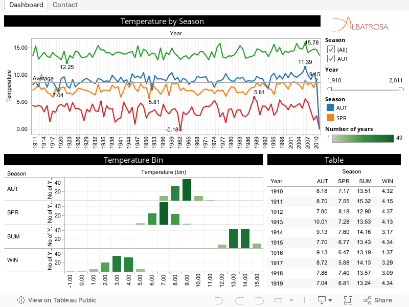
This year’s average summer temperature of 13.63 degrees has significantly dropped from last year’s average of 14.65, and is well below the 100 year average of 13.99. This marks a significant shift where the last 12 years have been consistently above the average with the three warmest summers on record (peek 15.78 in 2006).
The average winter temperature was 2.43 degrees but warmer than the previous year’s 1.64 degrees and cooler than the 100 year average of 3.51 degrees.
Although in recent years temperatures have dipped, generally summers in the UK seem to be getting hotter. According to the visualisation our winters, autumns and springs also tend to be hotter than those experienced a hundred years ago. It appears that the summer of 2011 has bucked the trend.